


Laboratoria+
Redesigning an EdTech focused on female leadership
Edtech • Redesign • Latam 🌏
Laboratoria+ is a tech education company focused on opening doors in the industry for women in Latin America. They build on the legacy of their predecessor, Laboratoria, but whereas the latter is focused on entry level tech education, Laboratoria+ doubles down on this premise to help women reach leadership roles in the industry.
The Brief
After the creation of their brand identity, Laboratoria+ needed to implement and launch it from scratch across its digital ecosystem: website, digital handbooks, social media, etc.
Client
Laboratoria+
Industry
EdTech
Type of Project
Web Redesign
Year
2023
The Challenge
The challenge in this project was to analyse their current digital efforts, and expand their brand's guidelines for digital platforms such as: informative websites, digital handbooks and social media platforms.
My Role
UX Design / UI Design / Handoff to Development
Understanding the context
Laboratoria+ had previously collaborated with a branding agency to define their visual identity and set the foundations of how the brand communicates its value proposition.
The first milestone of this project was to review that visual system and identify how it could evolve to support better the brand’s presence and consistency in digital environments.

#01: A limited color palette The original color palette included four core tones that gave the brand a strong and memorable identity. However, in digital applications the palette felt somewhat restrictive. The vibrant fuchsia — one of the most distinctive brand colors — was difficult to use in user interfaces without overpowering other elements. This led to a reduced use of color overall, creating a more static visual experience than originally intended.

#02: Photography as the main visual asset The brand guidelines provided a strong direction for photography, focusing on empowered Latin American women in digital work environments — a powerful and authentic representation of Laboratoria+’s mission. Still, relying solely on photography limited the ability to differentiate between learning paths or create visual variety across digital content. This presented an opportunity to expand the system with new complementary elements.

#03: Untapped visual potential The brand system also included a set of geometric containers — mainly circles and squares — designed to hold content and create visual rhythm. In practice, only one of these shapes had been consistently applied, leaving room to explore the full potential of this visual language in digital interfaces and layouts.
Wireframing and
UX Design
I organised the wireframe stage in two big chunks: First, a homepage which could quickly explain the differential value of Laboratoria+ and which could present the learning areas proposed for each student. The second was the visual organisation of the courses. It was primarily the information of each course: what it’s about, what they will learn, work on, concepts to apply. These are quite imposing, lengthy texts, and I had to find a way to make them easier to digest for a potential applicant.
Once this route was double-checked and confirmed by the client for a first release, we moved onto the next step: applying UI guidelines and creating the high fidelity wireframe which would be used as source of truth by development.


Building a User Interface Kit
As the design evolved, it became clear that Laboratoria+ needed a unified system to ensure long-term consistency across its digital products.
I created a L+ UI Library — a living guide that brings together the brand’s key visual elements: typography, colors, hierarchy, photography, and core components.
This toolkit empowers the team to scale the brand confidently and maintain visual coherence without depending on external design providers at every stage.


Bringing everything together
Now that I had an updated structure and a visual path in hand, I combined these two streams of work and proposed a responsive website, that aimed to make large chunks of informational content easily digestible.

Expanding the brand
Truth be told, no digital project sustains itself entirely in one site. It is the different points of contact that a user finds along the way that create the experience. This is why the expanded brand of Laboratoria+ had to be reflected in various pieces. After our first collaboration, I had the opportunity to apply the visual system we created to informational pieces such as: syllabi, culture, day to day documents,
and credentials for new students.
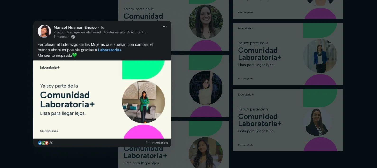
LinkedIn Certification

Social Media Posts

Documents and PDFs
Main Shifts
Based on the initial analysis of the project, we made 3 main shifts.
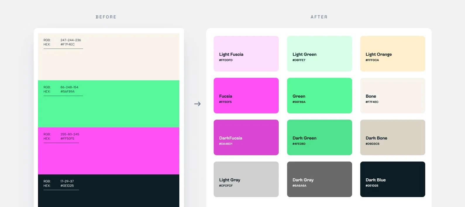
From four tones to a dynamic spectrum Expanded the color system from 4 to 12 tones, bringing more depth, flexibility, and accessibility to the brand’s digital presence.

Unlocking the container system Transformed the original shapes into a modular pattern that expresses the brand’s versatility and adaptability.

Beyond photography Introduced an icon library to enrich the visual language and help users digest complex information effortlessly.
Relevant Metrics 🎢
+150
Active Students after 6 months
8 🌏
LATAM countries and counting
Luckily the collaboration with Laboratoria+ has been a lengthy one, and it did not take long before we worked together on their new milestone: the creation of their Laboratoria+ Digital Platform, which I will discuss in another case study.